Vandana Mungur 9496 - Unit Four
Friday, 13 May 2016
Work Dairy - Sixth Shoot - Animation
This was my last shoot for my project before my exam. I wanted to show journey through animation; this would bring the theme of journey to life and allow the viewer to experience the image more, seeing different movements and actions. This was fairly simple, but I had to find the right angles for the animation. I struggled with this at first but I experimented and soon found that a straight on angle would be the best one to use. It should also be a wide angle, so that the viewer can see clearly what's going on in the image and understand its context.
This is my favourite animation from the whole shoot - I like the use of colour from the red buses as they are the only bright objects in the image. This allows the viewer to automatically look at the buses before paying attention to anything else in the animation.
I don't like the colour of this animation, it didn't quite come out right. I should have adjusted the aperture so that more light would be allowed into the lens, allowing me to create a brighter image.
Work Dairy - Fifth Shoot - Objects
For this shoot, I wanted to use possessions and objects in order to illustrate the theme of journey as well as let the viewer connect with the subject but without actually including the subject in the photograph. This was my main aim - I was planning to do this through connotations and symbolism, by picking certain objects, which would give little clues allow the viewer to work out what the subject is like and picture them. This was harder than I thought as I had to find objects to connotate different genders as well as personalities. However, I found that by combining more than one objects and by placing them together, I could create a subject for the viewer whilst still concentrating on the theme of journey.
This photograph is very successful. I like how the colours came out very bright, attracting the viewer and automatically make the picture more appealing as well as exciting. I also like the angle I chose, allowing the viewer to have a close up of the objects, so that they can pay more attention to it rather than the rest of the picture.
Having said this, this image did is not very sharp, which has affected both the quality and the success. I should have spent more time making sure the objects were in focus and also work on the framing as the hat was not all included.
If I could do this again, perhaps I would do it in a studio, which would allow me to manipulate the lighting to the brightness I want rather than rely on natural light.
Work Diary - Third Shoot - Short Day Journey (Countryside) Test Shoot
This shoot is a follow-up of the test shoot from the city for my exam, this is also a test shoot, which will allow me to compare the difference between objects or scenes I come across in the city and in the countryside. This portrays journey as the viewer will be able to see the transition of my journey from city to countryside and the distinction between the two will be highlighted. (see Work Diary - Seventh Shoot - Short Day Journey - City Test Shoot)
This is my best picture from this shoot - I like how there is huge contrast here, though colours and the ground. The wooden bar separates the grass and soil from the rocky ground. I used a low angle to that I could use the depth of field technique and show off this contrast. By placing the wooden bar right in the middle of the picture, I was able to create a guiding line throughout the picture, allowing the viewer to take a journey with their eyes.
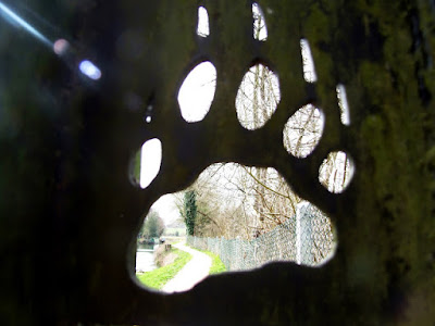
I like this picture and I think the idea was a very good one - I wanted to show the other side of the path through the paw, however, I couldn't get the aperture right so the path came out too bright. I think I could have used a different angle to reduce the light coming through.
For my exam, this test shoot has taught me to make better use of angles, this will help me show a scene or an object in a unique way and allow me to produce an exciting image.
Work Diary - Fourth Shoot - Depth of Field (With Subjects)
This shoot was exactly the same as my other shoot working with the depth of field technique. The only difference is the fact that I have used a subject for this one. (see Work Diary - Second Shoot - Depth of Field) The reason for using a subject is to add more emotion in my work, allowing the viewer to connect to the subject, thus engaging with the image.
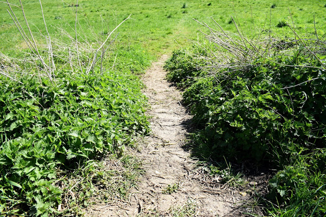
This is my most successful picture from this shoot, mostly due to the fact that the use of colour has been exaggerated and brings life to the image. The green grass make the path seem more friendly and suggest that the subject is not going on a dangerous journey. This gives out an atmosphere of adventure and slight mystery, almost inviting the viewer to follow the path.
This image did not turn out as good. This is because the image was not framed properly so it seems like there is too much going on, making it harder for the viewer to find the main focus of the image and work out its context. Perhaps I could have used a different angle to restrict the viewer's view and include less in the photograph.
In the future, I would like to use this technique even more, this will give my work depth and create a 3-dimensional element, making my pictures look realistic and even more exciting.
Subscribe to:
Comments (Atom)


