Showing posts with label Journey. Show all posts
Friday, 13 May 2016
Work Dairy - Sixth Shoot - Animation
This was my last shoot for my project before my exam. I wanted to show journey through animation; this would bring the theme of journey to life and allow the viewer to experience the image more, seeing different movements and actions. This was fairly simple, but I had to find the right angles for the animation. I struggled with this at first but I experimented and soon found that a straight on angle would be the best one to use. It should also be a wide angle, so that the viewer can see clearly what's going on in the image and understand its context.
This is my favourite animation from the whole shoot - I like the use of colour from the red buses as they are the only bright objects in the image. This allows the viewer to automatically look at the buses before paying attention to anything else in the animation.
I don't like the colour of this animation, it didn't quite come out right. I should have adjusted the aperture so that more light would be allowed into the lens, allowing me to create a brighter image.
Work Dairy - Fifth Shoot - Objects
For this shoot, I wanted to use possessions and objects in order to illustrate the theme of journey as well as let the viewer connect with the subject but without actually including the subject in the photograph. This was my main aim - I was planning to do this through connotations and symbolism, by picking certain objects, which would give little clues allow the viewer to work out what the subject is like and picture them. This was harder than I thought as I had to find objects to connotate different genders as well as personalities. However, I found that by combining more than one objects and by placing them together, I could create a subject for the viewer whilst still concentrating on the theme of journey.
This photograph is very successful. I like how the colours came out very bright, attracting the viewer and automatically make the picture more appealing as well as exciting. I also like the angle I chose, allowing the viewer to have a close up of the objects, so that they can pay more attention to it rather than the rest of the picture.
Having said this, this image did is not very sharp, which has affected both the quality and the success. I should have spent more time making sure the objects were in focus and also work on the framing as the hat was not all included.
If I could do this again, perhaps I would do it in a studio, which would allow me to manipulate the lighting to the brightness I want rather than rely on natural light.
Work Diary - Third Shoot - Short Day Journey (Countryside) Test Shoot
This shoot is a follow-up of the test shoot from the city for my exam, this is also a test shoot, which will allow me to compare the difference between objects or scenes I come across in the city and in the countryside. This portrays journey as the viewer will be able to see the transition of my journey from city to countryside and the distinction between the two will be highlighted. (see Work Diary - Seventh Shoot - Short Day Journey - City Test Shoot)
This is my best picture from this shoot - I like how there is huge contrast here, though colours and the ground. The wooden bar separates the grass and soil from the rocky ground. I used a low angle to that I could use the depth of field technique and show off this contrast. By placing the wooden bar right in the middle of the picture, I was able to create a guiding line throughout the picture, allowing the viewer to take a journey with their eyes.
I like this picture and I think the idea was a very good one - I wanted to show the other side of the path through the paw, however, I couldn't get the aperture right so the path came out too bright. I think I could have used a different angle to reduce the light coming through.
For my exam, this test shoot has taught me to make better use of angles, this will help me show a scene or an object in a unique way and allow me to produce an exciting image.
Work Diary - Fourth Shoot - Depth of Field (With Subjects)
This shoot was exactly the same as my other shoot working with the depth of field technique. The only difference is the fact that I have used a subject for this one. (see Work Diary - Second Shoot - Depth of Field) The reason for using a subject is to add more emotion in my work, allowing the viewer to connect to the subject, thus engaging with the image.
This is my most successful picture from this shoot, mostly due to the fact that the use of colour has been exaggerated and brings life to the image. The green grass make the path seem more friendly and suggest that the subject is not going on a dangerous journey. This gives out an atmosphere of adventure and slight mystery, almost inviting the viewer to follow the path.
This image did not turn out as good. This is because the image was not framed properly so it seems like there is too much going on, making it harder for the viewer to find the main focus of the image and work out its context. Perhaps I could have used a different angle to restrict the viewer's view and include less in the photograph.
In the future, I would like to use this technique even more, this will give my work depth and create a 3-dimensional element, making my pictures look realistic and even more exciting.
Work Diary - Ninth Shoot - Motion Blur (Night)
This shoot consisted of the exact same technique of motion blur which I used for my other motion blur shoot, the only difference being at night. (see Work Diary - Eight Shoot - Motion Blur - Day) I did this to show the comparison between time and how the same technique could be affected - I also had to experiment with the different light effect that I got from each moving vehicle.
This image is one of my favourites as it came out exactly as I hoped it will. I framed the image so that the bus comes from the left side of the image, as if it is going to go straight through the photograph. I also like how the lights from the bus has come out; in a straight line so it makes it look like the bus is going really fast and the lights also allows the bus to stand out from the rest of the scene, which is not as lit up.
This picture was not a success. The light trail is not straight or long enough, which makes it less exciting. It is also a very similar warm colour to the road and the rest of the picture, which has prevented it from standing out and being the focus of the image.
If I could do this shoot again, I would spend longer on perfecting the light trails and create longer ones, I would also experiment with angles and produce even more exciting images.
Work Diary - Seventh Shoot - Short Day Journey (City) Test Shoot
This shoot was a test shoot for my exam. I aimed to carry out a documentary like shoot, where I was able to portray journey through objects or scenes that I would come across on a short day journey in the city. This was a simple idea at first and I thought it would be easy and straight-forward, but as I started progressing with my shoot, I noticed that there were a lot of techniques that I could use to achieve this, which meant I had to experiment with the different angles and aperture settings. I found that untraditional angles, such as a high or low angle would produce a more exciting picture and make the scene look more interesting - as if there is more going on, creating an illusion and engaging the viewer even more. I also found it hard to find objects to capture as it was mostly transport. I had to walk around a bit more and go to less busy places to find more interesting image opportunities such as signs and objects that have been left behind by other individuals.
I really like this image from my shoot as it shows journey in two ways; through my point of view as I am taking this shirt day journey and coming across this homeless person's 'sleeping bag' but also through the homeless person's point of view, showing the journey they are on. This spot has clearly been abandoned, implying that the person has moved on and perhaps, had to find another place to sleep that night. It also looks very out of place, creating curiosity in the viewer and maybe even making them uncomfortable.
In contrast, this image did not turn out as well. The trees in the background blend in with the sign and prevents it from standing out - if there were no trees, this photograph would have been a success, especially with the angle I chose.
If I could do this shoot again, I would spend more time walking around and explore another part of the city, maybe a rougher area.
Work Diary - Eight Shoot - Motion Blur (Day)
For this shoot, I wanted to concentrate on the technique of motion blur, allowing me to show movement and manipulate the speed of an object or a subject when doing so. When I first started, I had to experiment with the shutter speed as I wanted to make sure that I could create the blur I wanted for each image. However, as the shoot progressed, I was able to do this better and allowed me to spend more time framing my image rather than playing with the shutter speed. I think the framing of the image was one of the most important feature with this technique as it allowed me to include what I wanted in the background so that I could make my moving subject/object stand out and be the focus of the image - this was my main aim. This shoot allowed me to show journey through actual movement and show how fast or slow something or someone was travelling.
This was one of my favourite images from the shoot. I particularly like the use of colour here - the red backpack forces the subject to stand out, especially against the bright yellow objects in the background. Although the yellow colour is brighter than the red, because the red takes up a lot of the image, it still remains the first thing a viewer would look at when looking at this image.
On the other hand, this image was not as successful as I thought it would be. This is because of the cars on the right of the photograph. Initially, I thought this would work as it would contain the subjects at the pelican crossing as well as the cars moving. However, the cars take away the attention from the subjects, which is where I wanted the main focus to be.
In the future, I would like to use this same technique but at night; this would allow me to capture the lights and create light trails, showing the theme of journey. This would also require a lot of experiment, which will give me a better idea of how to use this technique and perfect my skills.
Connecting Essay Four
This is an image I found on the internet, which uses the technique of depth of field. The main element here is colour; the photographer has used this to his/her advantage and represent the subject's culture through his clothing. This has also allowed him to create significant contrast between the dark blue and red clothing and the background, which is not as bold as colours. By doing this, the photographer was able to really emphasise the depth of field, allowing the viewer to see the blurred background. This forces them to focus on the subject as the view has been restricted, however, this gives out the theme of journey as it shows another culture and implies the idea of travelling, which has been enforced through the depth of field technique. The photographer has also chosen to use a close-up angle of the subject and having him look straight at the camera; this bonds the viewer with the subject as they pay most attention to him, trying to figure out his personality and understand his culture. Therefore, this engages the viewer with the picture and encourages them to spend more time on the image and its context.
This is my own image from my depth of field shoot with a subject. I have used dark clothing on my subject so that he stands out from the rest of the scene, which is quite bright. This makes him the main focus of the photograph and ensures that the viewer pays attention to him prior to looking at the rest of the image. I use the depth of field technique here but the background is not as blurred - this is because I wanted the viewer to understand the scene and engage with it most than with my subject, this is a reason why I have my subject with his back to the camera; this breaks the bond between him and the viewer.
In summary, both pictures are similar but have some differences. For example, the subject in the first picture is facing the camera, whereas my subject is facing his back to the camera - this creates different aims and creates a different atmosphere for the viewer. Also, the use of colour is not very similar, as the first image uses bold colours such as blue but I have decided to use plain black instead. Having said this, although the use of colour is different, this element was still use for the exact same aim - to allow the subject to stand out, so that they are the first thing the viewer sees when laying eyes on the photographs.
Overall Evaluation
Overall, I have really enjoyed this project. I was able to work with techniques and experiment with them in order to produce exciting and unique images, which show the theme of journey. When I first started this project, I planned my shoots in advance so I had a rough idea of what I wanted to achieve. After doing my research on photographers, I found that their techniques were very repetitive so that they may achieve this idea of journey - one of the most common technique was depth of field; I explored this deeper and decided to carry out a shoot experimenting with this. I was able to manipulate the angles of my images and decide which would show off this technique better whilst still making the image attractive. I also found that the use of colour was very important when working with journey; by adding attractive and bright colours to my work, I am able to guide the viewers through my photographs and control where they first pay attention to as soon as they look at the image, I think this is important as I brought them on a journey around my pictures. One challenge which I think I faced was when I was shooting in the city of London; the busy city life meant I didn't have much time to frame my images as the buses were travelling and so were everyone around me. However, I overcame this and framed my images in advance, meaning I set my camera up and waited for a bus to come rather than spot one and hurry to capture it. This made a big difference to my work and allowed me to gain control over my photographs so that I could frame it better and include exactly what I wanted in the scene. If I had the chance to do this project again, I would carry out some shoots in the studio, which would further allow me to experiment, especially with the lighting and it would be a challenge to find ways to represent journey through objects in the studio. Moreover, I would also complete some more connecting essays along with some more photographer research; this would allow me to be more critical of my work and analyse it so that I may improve. It would also allow me to gain a deeper insight on the type of pictures used to symbolise journey, which would help me add more symbolism to my work and thus, engage the viewer even more.
Photographer Research - Daniel Nahabedian
Daniel Nahabedian is very good when working with lights and colour. He uses the element of light so manipulate his images, deciding on what he wants the viewer to focus on or not. He also uses a similar technique with colour so that he can distinct between the important parts of his images and the non-important ones. I also enjoy how he turns an ordinary scene into a majestic one just by using light, colour, and sometimes angles. I have noticed that his angles are mostly low or wide ones; this allows him to further emphasise on the importance of a scene or a building.
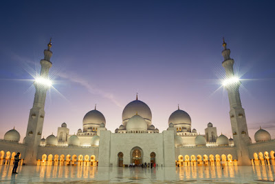
This image has a very interesting angle - by using a low one, Nahabedian is able to show off the building and include most of it in the image, while making it seem majestic. The size and shape of the temple is both highlighted as well as exaggerated in order to give importance to the building and ensure that the viewers pay their full attention to it. The lights on both side distract the viewers and forces them to focus on the main part of the temple and notice its circular shape at the top. This gives the photographer the ability to manipulate where the viewer focuses on in the image, helping them achieve what they want. The use of colour is also very good; the sky has an ombre effect, almost fading into the same colour as the building. Although the photographer aimed to create contrast here, he also wanted to connect the sky with the building in order to show connotations of size for the temple - he suggests that the temple is immense in size, just like the sky. This adds symbolism to his work and engages the viewer as they have to delve in deeper so that they may work out the context of the image.
It is evident that Daniel Nahabedian has created significant contrast in this picture, proving to be his main aim. By achieving this, he has now structured the rest of the picture - the contrast distincts between the lanterns and the dark sky, allowing the viewer to concentrate on the lights around the image and get an idea on what's going on in the scene. Once again, a low angle was used so that a large part of the scene could be included in the photograph, enabling the viewer to picture the scene better in their mind. This also allows Nahabedian to make good use of the framing and fill it up with the lanterns, making the image exciting and full so that it seems like there's a lot going on. The photographer has also made sure that the viewers can see his subjects, which further allows them to engage with the scene and work with the context of the image. It is unclear what the occasion is, leaving the viewers to use their imagination, which invites them on a journey, highlighting the theme. As they wonder why these lanterns are being lit, they also wonder about the journey of the lanterns and possibly how long they are going to last. This is an indirect way of illustrating this theme, through symbolism and meaning. This produces an exciting and adventurous image, evoking feelings of curiousity and wonder in the viewers.
The use of light here is incredible. The rays of sunlight are guiding the viewers and letting them know where in the image they should focus. It also creates a contrast between the colours as it makes certain colours look more important than others. For example, the green towards the bottom of the picture look more important that the green in the background from the view - this is so that the viewer won't pay much attention to the view but rather the building and the greenery around it. This is further achieved through the technique of blurring; it is evident that the view in the background is very slightly blurred whereas the building is very sharp. Once again, this tells the viewer where to focus and adds symbolism to the image, making the building look majestic and giving importance to it. This is achieved through the light rays as well, which make the viewers wonder about the building and gives out an adventurous atmosphere.
Like most of his other work, the element of light is being used to a large extent in this particular image. The bright yellow tone from the building creates a huge contrast with the blue colour from the sky, drawing the viewer in and automatically forcing them to focus on the brighter colour, which is the yellow colour of the building. This gives out connotations that the building is of importance and it's the only sign of life in the whole image, further emphasising its importance. From this technique, the viewer can fully engage with the image and it gives them enough clues to work out the context. The angle is very wide, allowing the photographer to capture a big part of the scene, making sure the whole building fits in the photograph, enabling the viewer to build a better image in their mind of the context.
This is my own image from my depth of field shoot - similarly to Nahabedian's work, I have used natural lighting from the sky to make the scene look majestic and give it importance through symbolism. The fact that my subject is dark creates contrast between him and the background, which has a brighter tone of green and blue/grey. By doing this, I was able to ensure that my viewer focuses on my subject first prior to moving around the image.
In conclusion, I picked this photographer for my research because his images are very inspiring. His use of light and colour dramatically changes and manipulates an image in the way he wants it to so that he may achieve his aims and get his viewers to focus on exactly what he wants them to. This keeps his work exciting, inviting viewers to find out more about a certain picture and think about its context. It also invites the viewer to picture the scene in their heads and imagine being there, depicting connotations of adventure.
Connecting Essay Three
This image on the internet uses the technique of depth of field in order to illustrate the theme of journey whilst including elements such as colour, shadows and lights, as well as blur. This adds diversity to the image and creates curiosity in the viewer, almost inviting them to spend more time working out the image. The dark colours throughout the image shows connotations of mystery and invites the viewer to explore the photograph, working out the context. The light flares around the picture also adds to this mysterious atmosphere and further contributes to the theme of journey - the depth of field technique has prevented the viewer from what's ahead, along with the lights, but the subject looks as if he is about to start walking that way, heading towards the blurred path, emphasising journey.


This is my own picture I have created using a depth of field technique. I decided to use a low angle to restrict the viewer's view and include at little as the subject as possible so the viewer can't connect with the subject. This is so the viewer concentrates on the scene and the theme of journey rather than the subject, however, I still allow them to notice the subject and understand that the subject is going on a journey. I also made sure the path is not clear at the end, and I used this angle to my advantage, blocking the view after the bend. By doing this, feelings of curiosity are evoked in the viewer, making them wonder about the scene and where the subject could be heading to. I have also used the element of colour and shown great contrast between the grass and the rocks. The green grass act as a guiding line, starting from the bottom of the picture and guiding the viewer through the path, taking their eyes on a short journey, which further emphasises the theme I am trying to put out. The rocky ground does exactly the same thing but due to the fact that it's a different colour, it creates a pattern, adding repetition and the element of lines to the image, further improving the photograph and makes it even more exciting.
Overall, these two pictures are similar in the way that they use the same angles and techniques to achieve similar aims. By using low angles, both images are able to restrict the viewer's view of the scene in order to make them wonder and add an adventurous atmosphere to each photograph. Another way the pictures are similar is through the use of colour creating contrast. The first picture uses dark colours as well as lights in order to create this contrast and most of the colours fade into each other, creating an ombre effect and allowing the image to flow, whereas my photograph uses bright colours which are completely different from each other. Despite this, both images still use the colour available in the scene to their best advantages.
Subscribe to:
Posts (Atom)